
Retro pre-hydration shell
Launching CodeGrind...
Please wait while the desktop runtime restores your session and loads the app shell.
Startup progress
Retro pre-hydration shell
Please wait while the desktop runtime restores your session and loads the app shell.
Startup progress
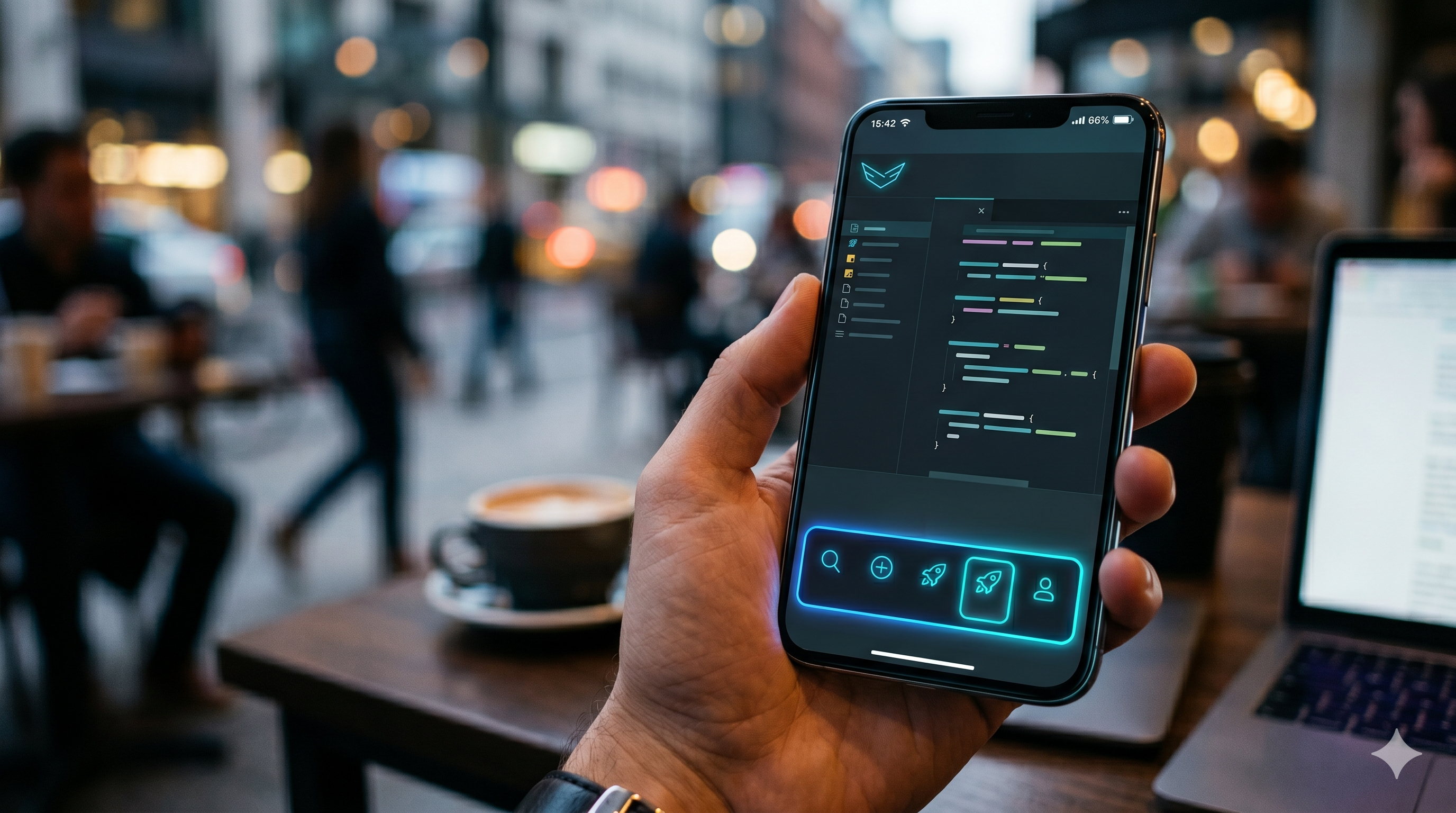
Mobile Mode on CodeGrind Is About Continuity, Not a Shrunk Desktop
There are two bad ways to build for mobile. One is to block the experience entirely and tell people to come back on desktop. The other is to cram the full desktop interface into a phone-sized box and pretend that counts as support. CodeGrind needed a third option. The new mobile work is about continuity: keeping navigation, shell controls, install flows, and quick actions close enough that the platform still feels alive when you are on a phone instead of at a desk.
by CodeGrind Team
People do not only encounter learning products in ideal conditions. They open them during a break, on a commute, from the couch, or between meetings. If the mobile version feels like a broken fallback, the platform quietly trains users to wait until they have perfect conditions to come back. Most of the time they do not.
That is why the mobile work matters even for users who still prefer desktop for longer coding blocks. A good phone experience does not have to replace the main workspace. It has to preserve momentum. If someone can navigate, launch, continue, install, and manage the shell without friction, the platform stops disappearing between “real” sessions.
The biggest change is the route-aware mobile dock. Instead of giving every screen the same generic footer, the dock changes behavior based on where you are. It can expose home and profile actions, store and upgrade shortcuts, shell visibility toggles, fullscreen controls, and install actions for supported mobile browsers.
Underneath that, the shell now tracks whether specific surfaces like the home demo, problem workspace, cluster map, tower defense shell, or city route should stay visible. That makes mobile feel intentional instead of brittle. You are not just seeing a compressed desktop page. You are seeing a version of CodeGrind that understands what route you are on and what controls matter there.
Some of the least glamorous mobile work is the most important. Store and gameplay surfaces now account for orientation, and the shell can request fullscreen or prompt installation through the browser when that path is available. None of that is splashy, but it removes the small bits of friction that make phone sessions feel temporary and second-class.
The right mental model here is not “mobile edition.” It is “same account, same world, fewer excuses to bounce.” If a user can continue from a phone, then return to desktop later without feeling like they crossed into a different product, the platform becomes easier to keep in rotation.
The main thing mobile mode protects is habit. Short sessions count. Checking the city, opening the demo, browsing the store, managing profile or shell state, or launching the next step in a learning path all keep the platform mentally close. That closeness matters because consistent practice is usually lost in the gaps between sessions, not inside the sessions themselves.
We are not pretending a phone is the perfect place for every coding task. We are building a version of CodeGrind that respects the fact that people live on phones anyway. The mobile shell is the bridge that keeps the platform usable in those moments instead of turning them into dead time.
The current mobile work centers on a route-aware dock, fullscreen support, install prompts for supported browsers, and shell controls that adapt to the page you are on.
No. The goal is continuity, not a full desktop clone. Mobile mode is there to keep navigation, quick actions, and shorter sessions smooth so users can stay engaged between larger desktop sessions.
Yes. The mobile dock explicitly accounts for city routes and keeps the compact shell behavior available on touch-first navigation paths.
The Hello World tower defense demo runs right on the home page. No signup, no install, just open it and play.