
Retro pre-hydration shell
Launching CodeGrind...
Please wait while the desktop runtime restores your session and loads the app shell.
Startup progress
Retro pre-hydration shell
Please wait while the desktop runtime restores your session and loads the app shell.
Startup progress
The CodeGrind Homepage Tutorial Is Now a Real Onboarding Mission
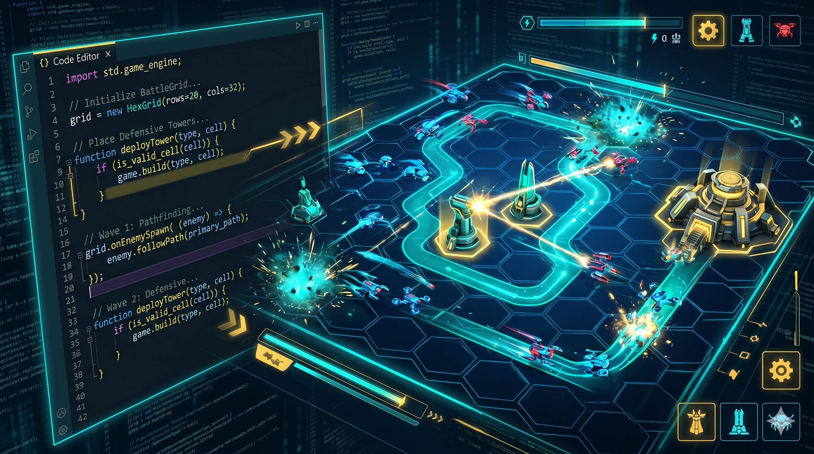
Homepage demos usually lie a little. They show a motion reel, a fake terminal, or a watered-down mini interaction that feels nothing like the actual product. We wanted the opposite. The CodeGrind homepage tutorial now runs a real onboarding mission from the learning path flow, embedded directly into the landing experience. That means a visitor does not just watch the pitch. They solve an intro problem, defend the base, and then step into the next part of the platform from there.
by CodeGrind Team
A tutorial should not be a decorative layer hovering above the real product. If the first interaction teaches a different rhythm from the one users will meet after signup, it trains the wrong instincts. That is one of the fastest ways to create drop-off right after the first click.
The homepage now solves that by embedding the real tower defense onboarding level instead of a fake stand-in. The mission is tied to the same learning-path structure, the same onboarding identifiers, and the same gameplay logic we use elsewhere. The landing page is finally showing the product as it actually behaves.
The experience opens with a full boot-sequence layer, then hands off into a live Code Breach demo. Visitors are not just reading about tower defense coding. They are walking into the intro shell, seeing the grid and mission feed come online, and clearing a small real problem under the same gameplay framing the rest of the platform uses.
Once that mission ends, the page does not strand people. The copy and follow-up flow explicitly position the next decision: keep going through the beginner learning path or move toward interview prep clusters. That is a stronger funnel than a generic “sign up now” button because it turns the first success into a concrete next step.
The recent homepage work was not just about embedding the mission. We also tightened the guidance inside it. Slot locking and reveal timing were adjusted, the early demo sequence got clearer progression, and the tactical callouts became more explicit. Those sound like small tweaks, but onboarding quality usually comes down to small clarifications stacked together.
When someone is seeing the product for the first time, every ambiguous cue feels larger than it really is. Better callouts, better reveal steps, and cleaner pacing do not just make the mission more polished. They reduce the odds that a promising user misreads the system in the first ninety seconds and leaves before the fun part lands.
Search traffic converts better when the landing experience matches the query that brought someone in. If a person searches for a coding game, a tower defense coding platform, or a beginner-friendly coding demo, the homepage now answers that intent directly. It does not just describe the loop. It demonstrates it.
That matters for native blog strategy too, because owned content can now point readers to a homepage experience with a precise promise: solve a real intro problem, defend the base, and then choose where to go next. The tighter that promise is, the easier it is to write content that ranks honestly and holds attention after the click.
Yes. The homepage tutorial now embeds the real onboarding mission used in the learning-path flow rather than a fake or heavily simplified placeholder.
The flow is designed to hand you into the next meaningful step, especially the beginner learning path or the interview-prep cluster route, instead of dropping you onto a dead-end marketing page.
The onboarding sequence now has clearer reveal timing, more explicit callouts, and a better early-mission structure so new users understand the loop faster.
The Hello World tower defense demo runs right on the home page. No signup, no install, just open it and play.